ANZ Billing Inc.
Mobile App | UX/UI Design Lead | 2023
A user-friendly and visually appealing responsive website that effectively showcases ANZ Billing’s services.
Role
Timeline
Client
Tools
Lead UX / UI Designer
4 - 6 weeks
ANZ Billing, Inc., 2024
Figma, Procreate, Maze, Optimal Workshop
Challenge
Solution
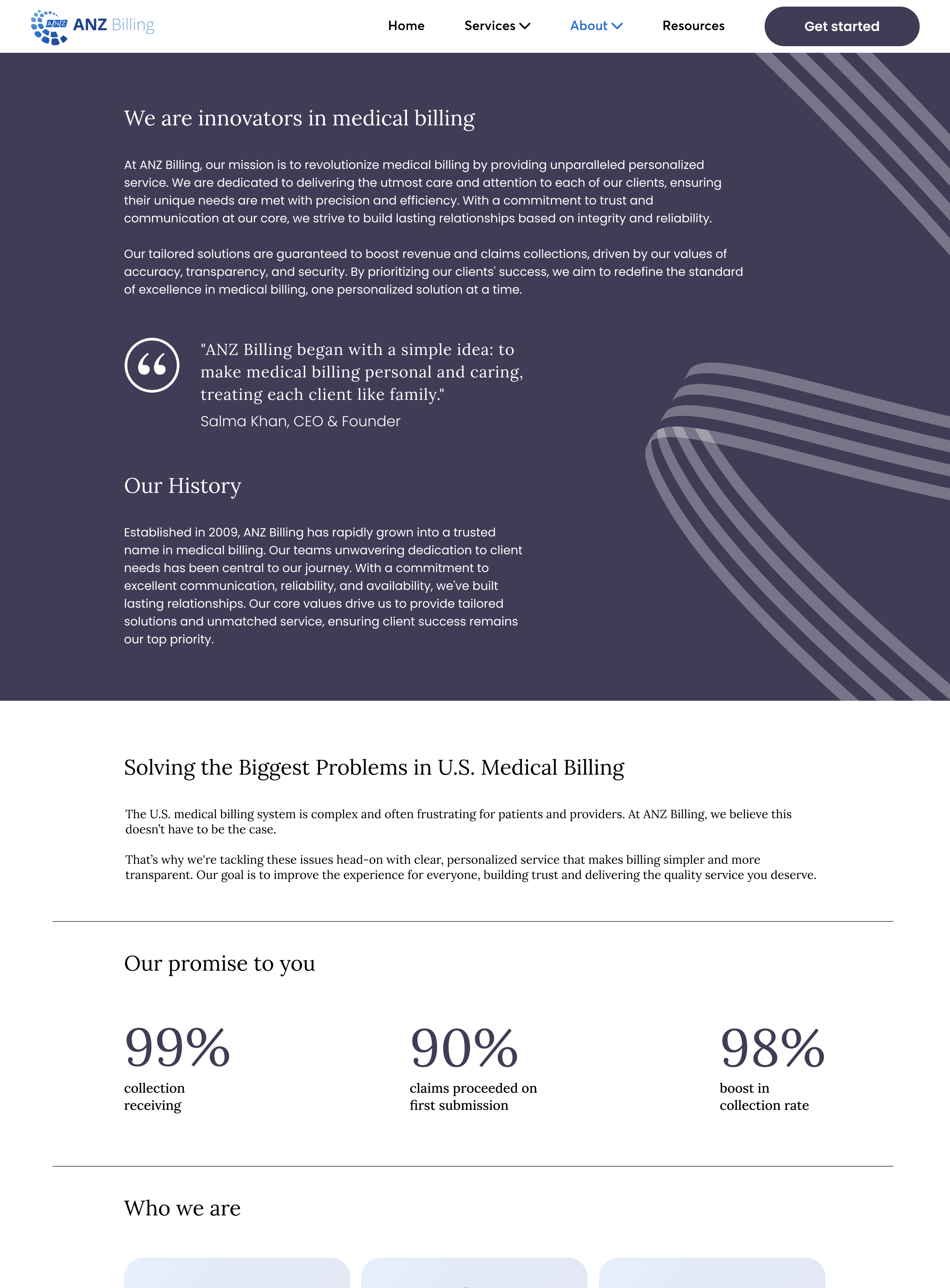
ANZ Billing is a small medical billing company that is dedicated to serving practices and their patients in all matters related to medical billing and revenue management.
Medical providers who don’t understand the complexities of medical billing often have trouble navigating constantly changing medical billing systems and processes, and are in need of a reliable partner that they can trust to guide them.
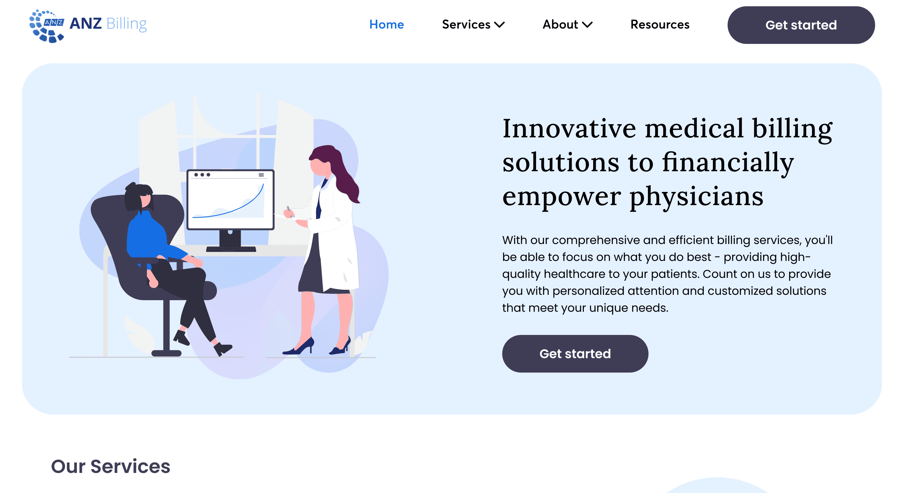
The proposed solution is to create a user-centric website for ANZ Billing.
This site must (1) effectively communicate their personalized medical billing services, (2) foster trust through client testimonials, and (3) incorporate intuitive navigation and engaging visuals to enhance the user experience and drive business growth.
I kicked-off this project by doing some white paper research and user interviews. I was given a 3 month timeline to carry out research, builds insights, design, and deliver.
White paper research
If the person handling the medical billing is more concerned with data and revenue than providing good service, a bad experience with them can make the patient see the entire medical visit in a negative light.
Generally, medical practitioners primarily focus on providing service and care to their patients, often considering healthcare from the start to the end of a visit. However, patients experience a more complex journey, extending beyond the visit itself. Once at home and faced with the bill, they navigate the intricacies of payment, involving interactions with insurance and billing companies. While doctors see healthcare and billing as separate, patients perceive them as interconnected components of a single experience.
User Interviews
All participants’ highest priority was seeing an increase in revenue, often emphasizing trust and consistency.
I conducted interviews with five physicians who have previous experience with medical billing companies. These interviews aimed to provide a comprehensive understanding of the key information and features that physicians prioritize when visiting a medical billing website.
Insight generation
Overall, data analysis revealed themes in patient satisfaction, trust, transparency and communication.
Heading into the data synthesis part of the project, I developed an affinity map to work as a visual aide for my data journey.
I sorted through user feedback and research insights, using the map as a roadmap to spot patterns and key themes. This streamlined decision-making, anchoring subsequent design choices in user insights and business needs.

The opportunity gap in ANZ Billing lies in their lack of web presence and marketing.
Market research revealed that ANZ Billing possesses a unique competitive advantage in its ability to provide a higher degree of personalized services that can increase revenue for medical practices.

Goals
Increased claims rate
First-pass payment rate
Patient satisfaction / retention
Frustrations
Errors and inaccuracies
Lack of expertise
Inefficient processes
Poor customer service
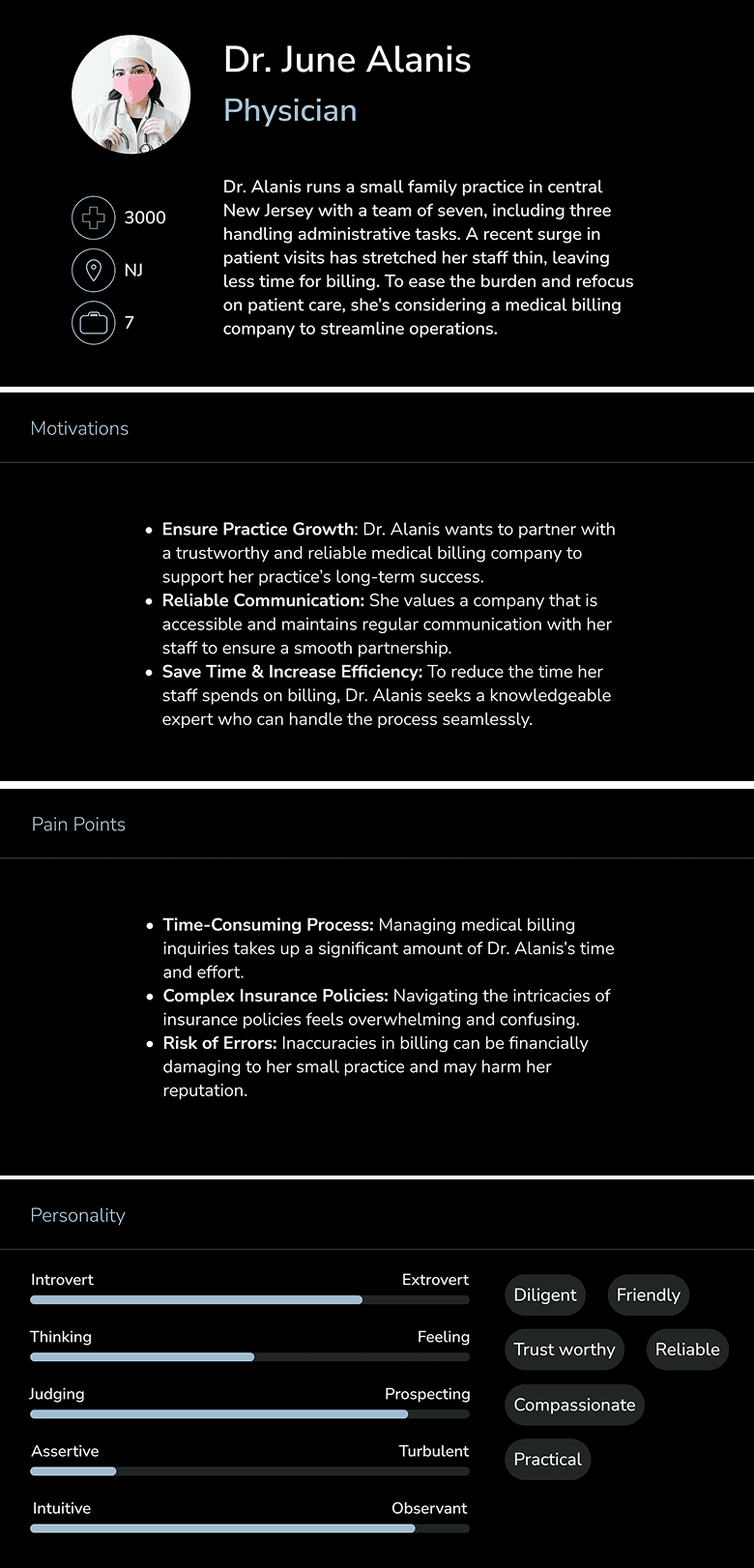
In humanizing my design process, the user persona became my guiding character, embodying the key traits and needs distilled from research, ensuring every design decision resonated with the target audience.
User personas

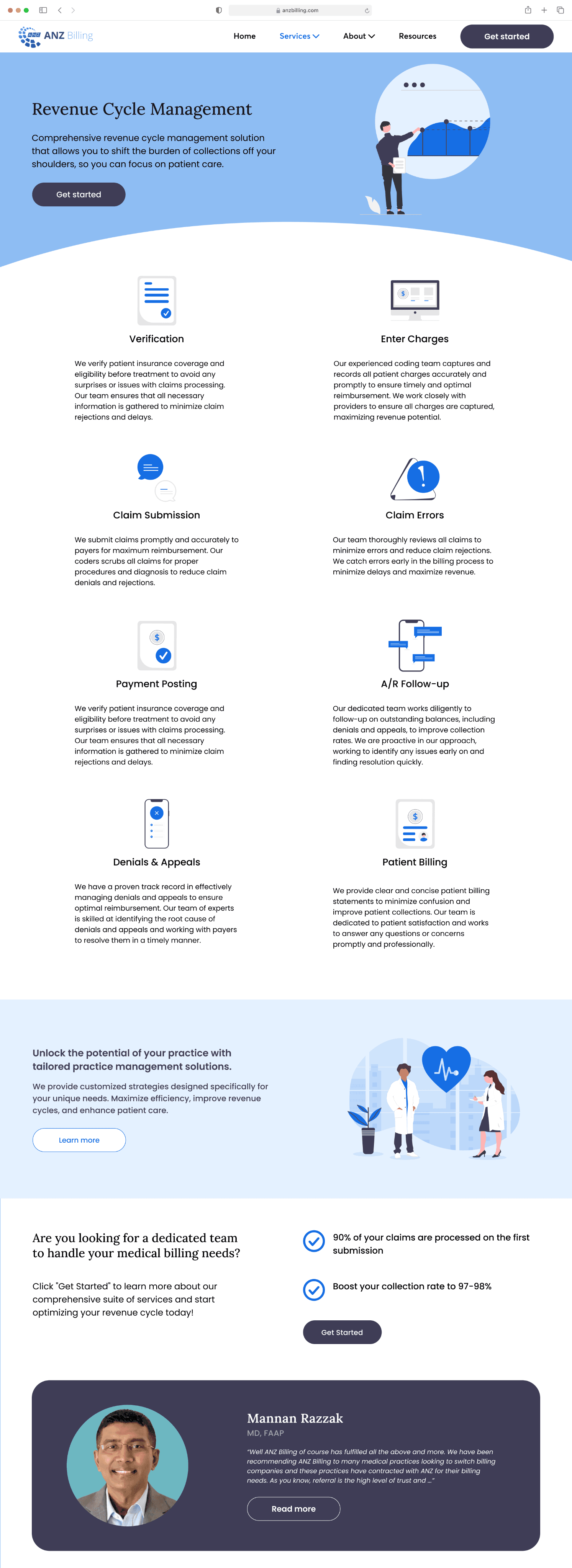
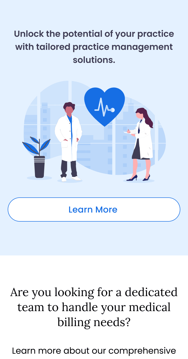
In order to showcase and emphasize how the high level of personalization ANZ Billing offers can increase revenue for doctors, this site should feature:
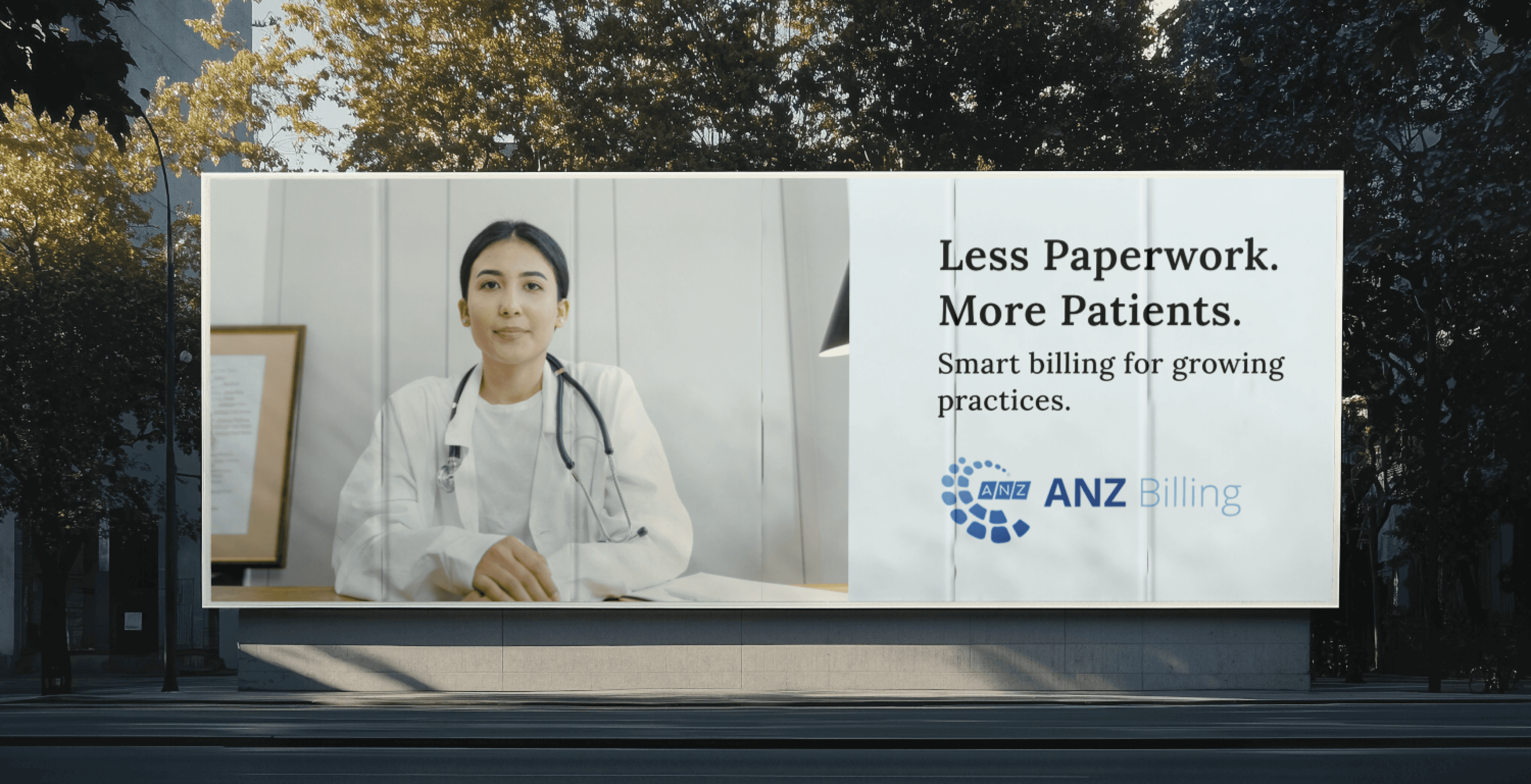
Clear and Compelling CTAs
CTAs guide users to key actions, enhancing visibility, reducing friction, and driving conversions by simplifying engagement.

Personalized Client Testimonials and Success Stories
Showcasing tailored success stories builds trust, highlights ANZ Billing’s personalized approach, and fosters confidence in potential clients.

Display of Analytics and Key Metrics
Showcasing key performance metrics in a clear format reinforces ANZ Billing's value proposition and boosts credibility, helping potential clients make informed decisions.

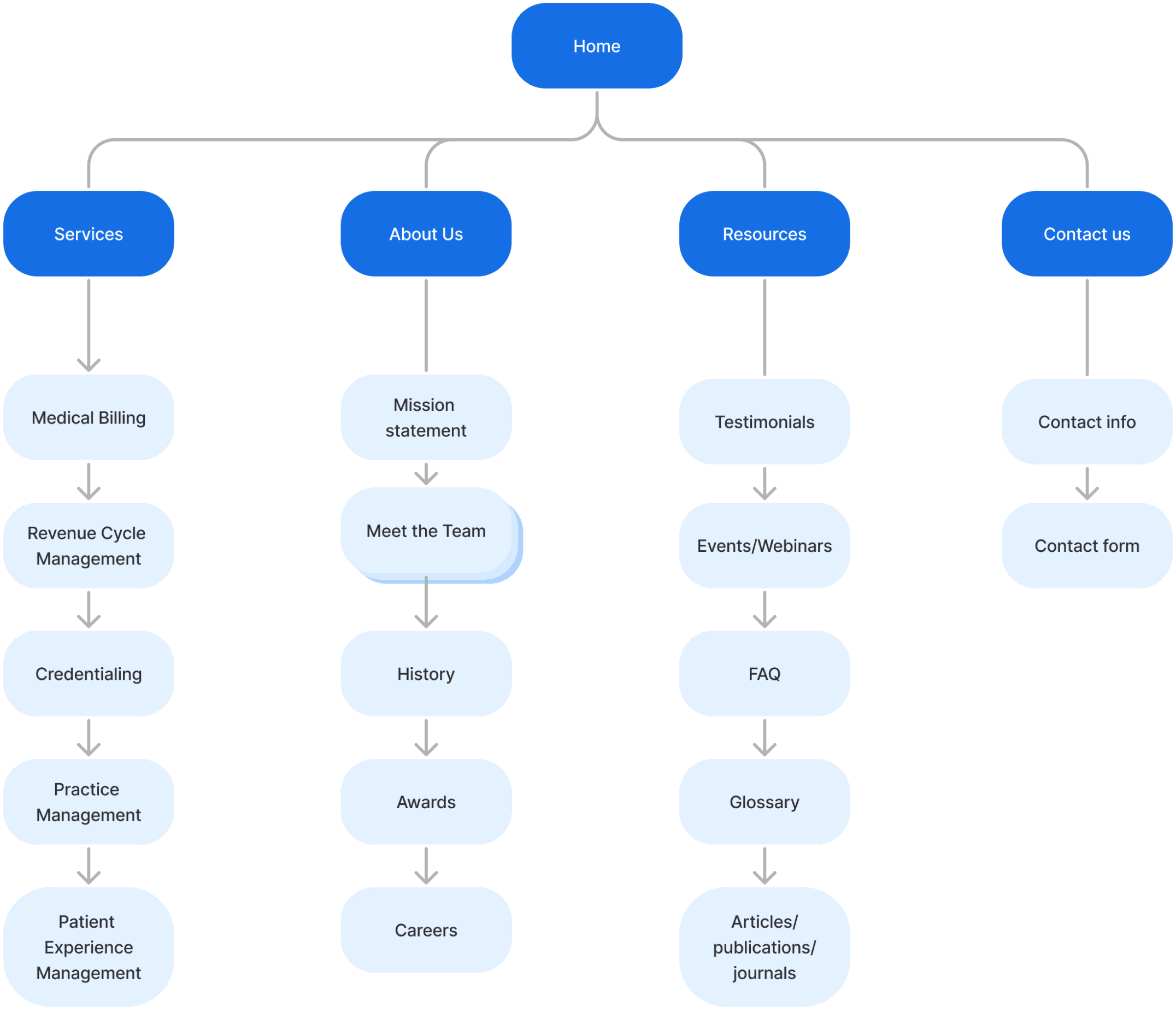
Site map
Site mapping was a key part of figuring out how to emphasize ANZ Billings strengths. Laying out the pages helped visualize the whole website, showing how the pages are organized, connected, and how users will navigate through it.
Since the services were a priority for participants, I ensured the site was information-dense by including service summaries and quick links on the landing page. Additionally, I linked each testimonial card to the "Success Stories" section under resources, providing users with direct access to firsthand experiences that highlighted ANZ Billing's capabilities and personalized approach.
Task flows
I crafted and tested three user-friendly task flows, collaborating closely with my client to align her business priorities with the needs of our target users,


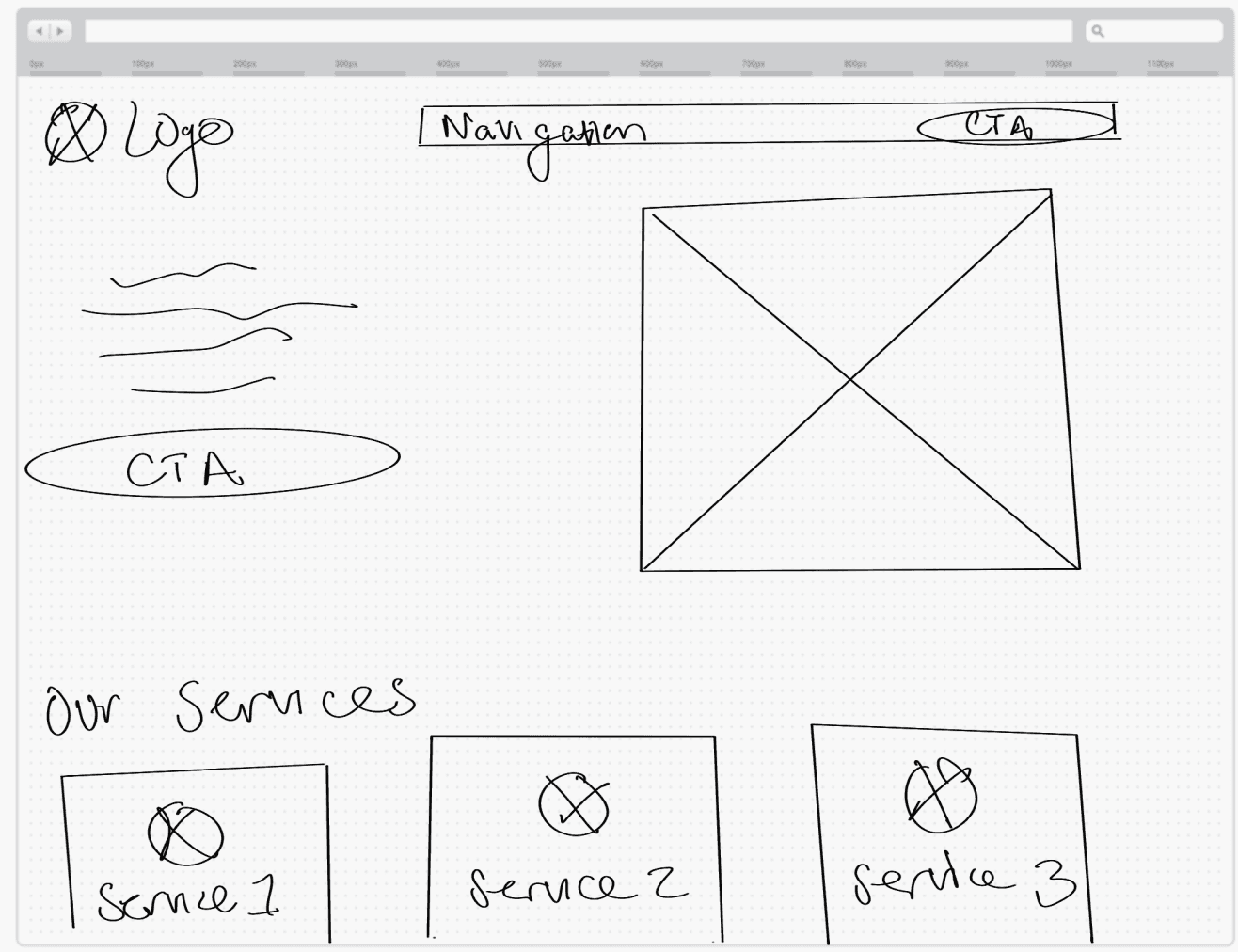


Designing around content
During my design process, I relied on low-fidelity wireframing as a key tool. However, without an existing website for reference, structuring text-heavy pages posed a challenge. To address this, I collaborated closely with my client, refining copy and layout iteratively based on their feedback. This process helped me create a clear, effective way to organize substantial text while ensuring alignment with their vision.
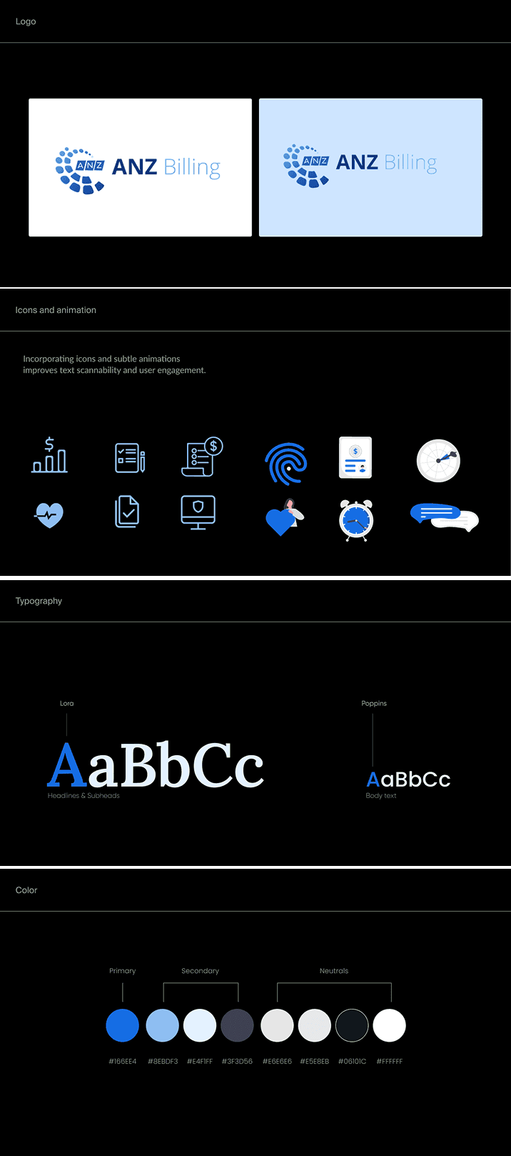
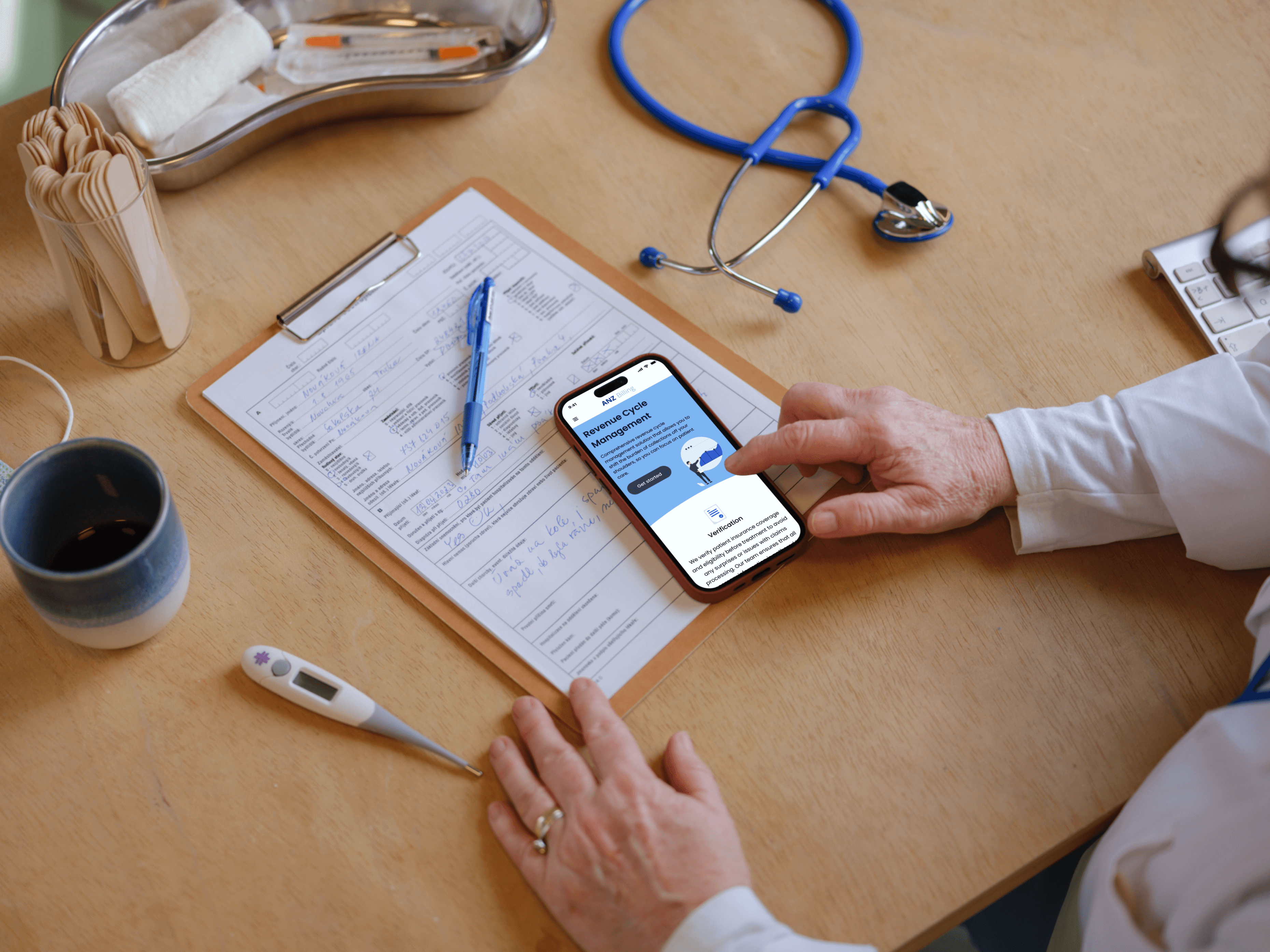
Icons and animation
At first, I chose simple single-line icons, but I soon realized that their simplicity led to more confusion rather than clarity for users.
To address this issue, I decided to incorporate more detailed and animated icons throughout the design where possible.
This shift in approach allowed for a better balance between visual appeal and effective communication, while enhancing the sites brand identity
During the design process, I planned to utilize icons and animation to:
Improve visual communication
Enhance scannability, and
Create a cohesive brand identity
Testimonial card


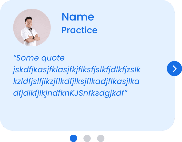
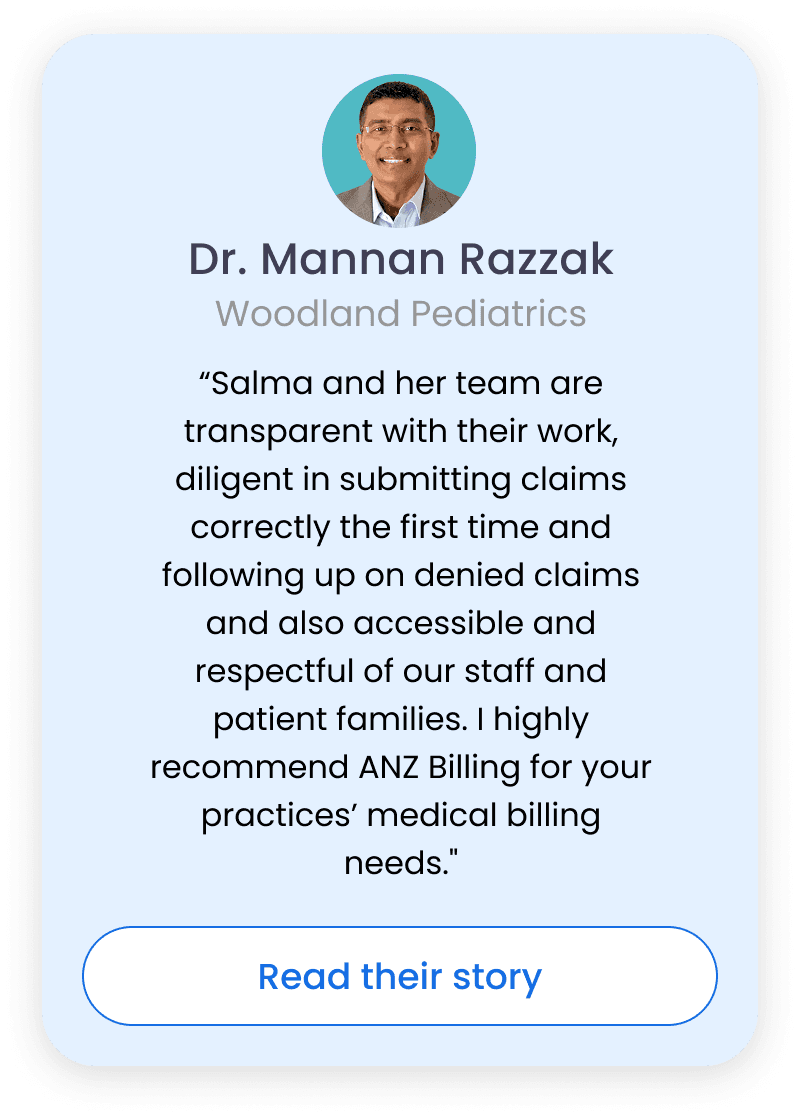


At this point, developing a style tile was a key part in solidifying the sites branding. I incorporated blue into my branding to align with the prevalent use of this color in the medical industry, ensuring that my brand resonates with the established visual language of trust and professionalism in healthcare.
Contacting ANZ
Problem: Users instinctively searched for a clear "Contact" button but struggled to find one, leading to multiple misclicks. Many hesitated to click “Get Started” as it felt like too much of a commitment rather than a way to reach out.
I tested three task flows with 10 users (5 moderated) to assess proficiency, identify issues, and refine solutions. I measured accessibility, readability, and both qualitative (body language, error correction) and quantitative factors (completion rate, time, errors, satisfaction).
User testing
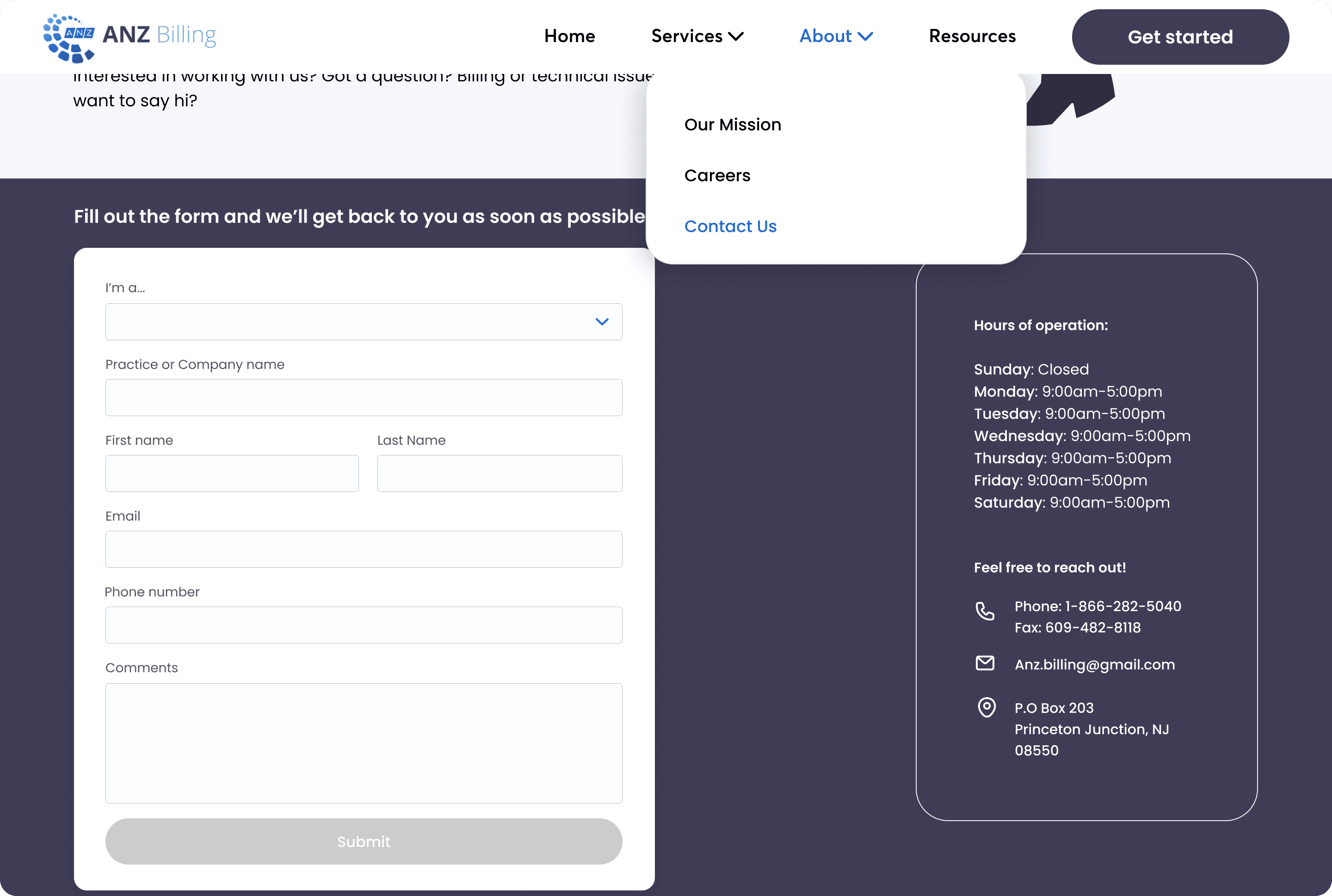
Careers
Problem: Users expected a clear "Careers" tab in the site’s navigation but were surprised to find it hidden within the "About" page. While they eventually located it, the pathway was not intuitive, causing observable confusion.


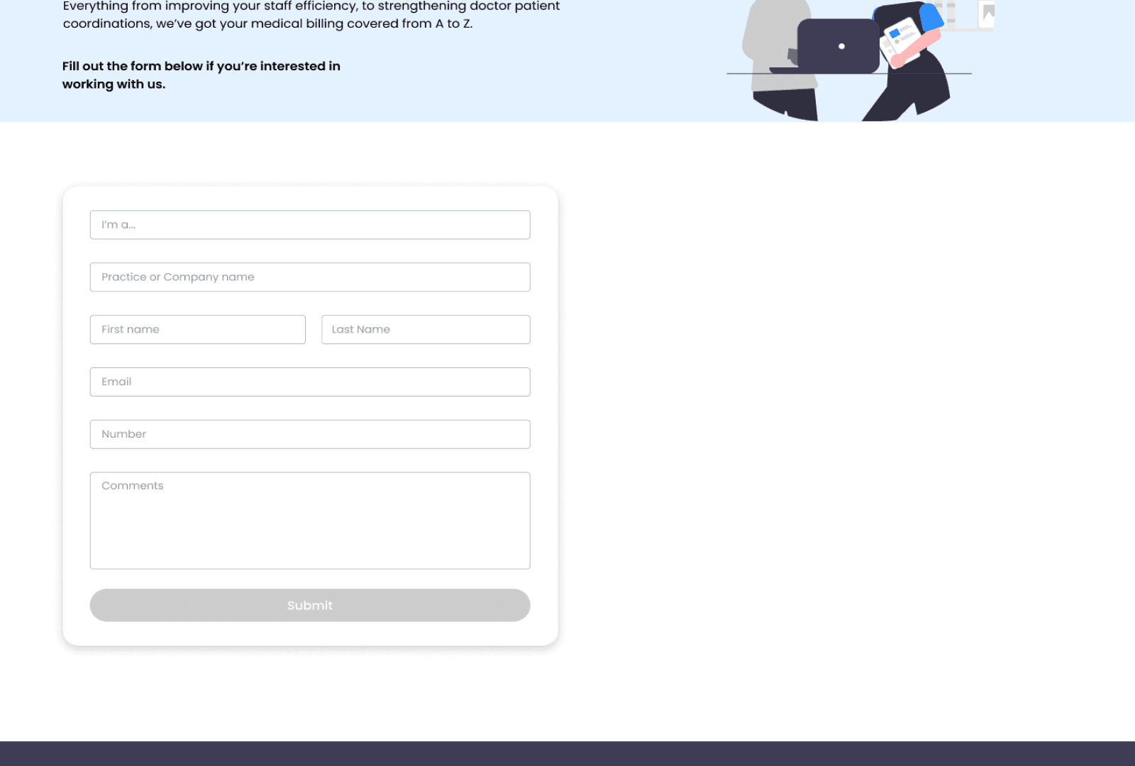
Sign up form
Problem: A free-text input for user categories led to inconsistent data entry, making automation and routing unreliable.


In conclusion
I’m pretty psyched to complete my very first UX project where I got to work collaboratively with a client (yay 🎉)! Although I hit some learning curves, I can overall say that this experience helped me hone in my skills as a designer.
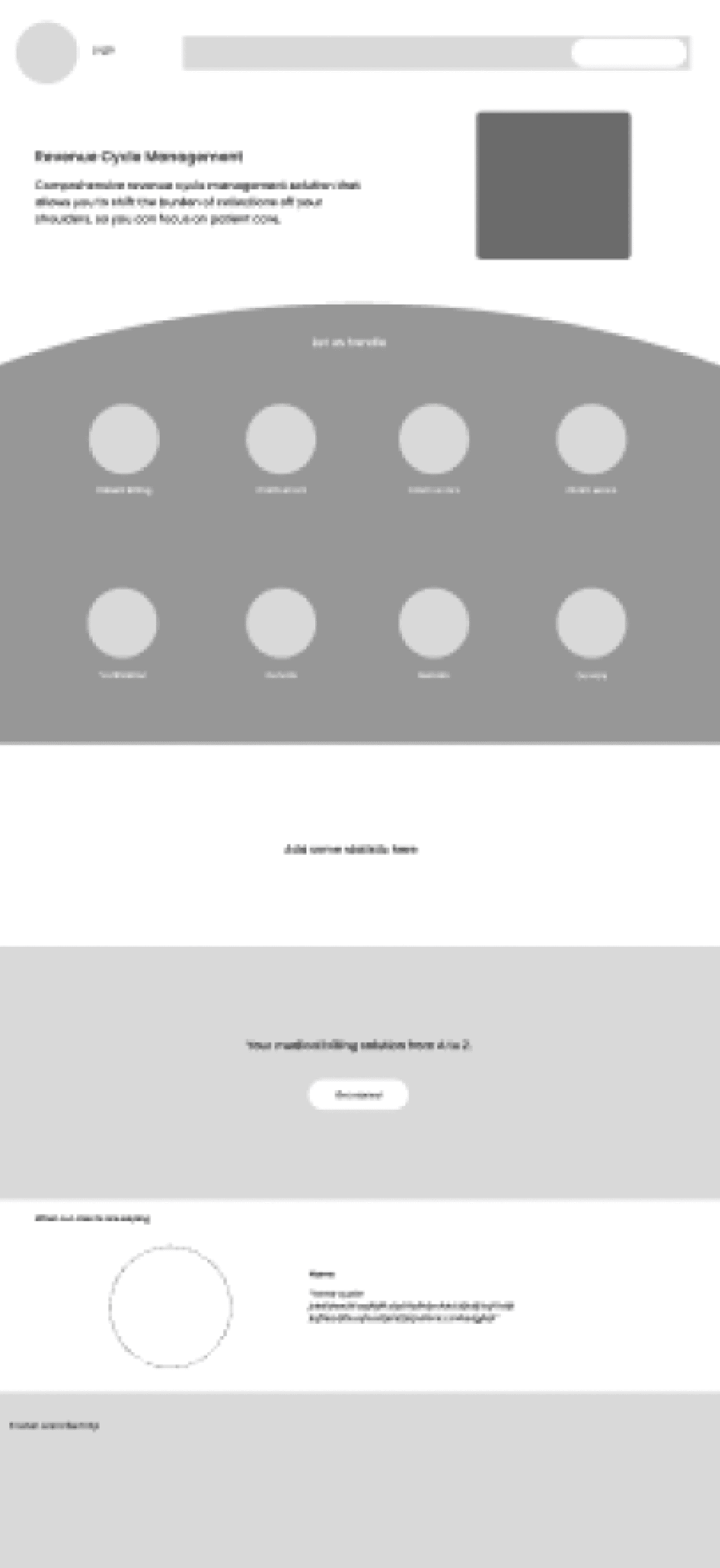
Navigating the design of mid-fidelity prototypes for text-heavy pages presented a challenge. Instead of committing to layouts that might need extensive revisions, I opted for a collaborative process with the client. Together, we defined essential content for each page, drawing inspiration from their needs and successful industry designs. This approach clarified content, enabling the exploration of layouts that accommodated text without sacrificing visual appeal or user experience. It underscores the power of collaboration in overcoming design challenges for a final product aligned with both client expectations and user needs.
Working on this project with the client was a real eye-opener. It wasn't just about making things look good; it was about finding that sweet spot between what the client wanted and what users needed and creating an experience that felt right. It taught me the power of teamwork in turning ideas into something tangible.
Looking back, it's clear how working together made the project a blend of style and function. It's a reminder that effective collaboration can turn the ordinary into something extraordinary.